JurkatQC Scraper: analytics solution for real-time monitoring of
streaming Mass Spectrometer data
Click here to test the app!
It was a Christmas break and Cambridge had nothing but snow. While staying at home I have been
scraping some messy quality metrics data that turned out
to be useful for monitoring longitudinal mass spectrometer performance.
Let me introduce this specialized analytics solution I developed while
working at the Broad Institute.
In this problem, the data is generated by a laboratory
equipment, called Mass Spectrometer. It is used to understand which
proteins are produced relative to each other in a given biological sample,
such as a tissue biopsy from a patient. They are highly sophisticated and
extremely useful to advance biological research.
Like many complicated tools, they are also expensive to maintain. Repairs can
cost thousands of dollars per year, so scientists regularly use standard samples and collect quality metrics data to monitor the
performance of their instruments.
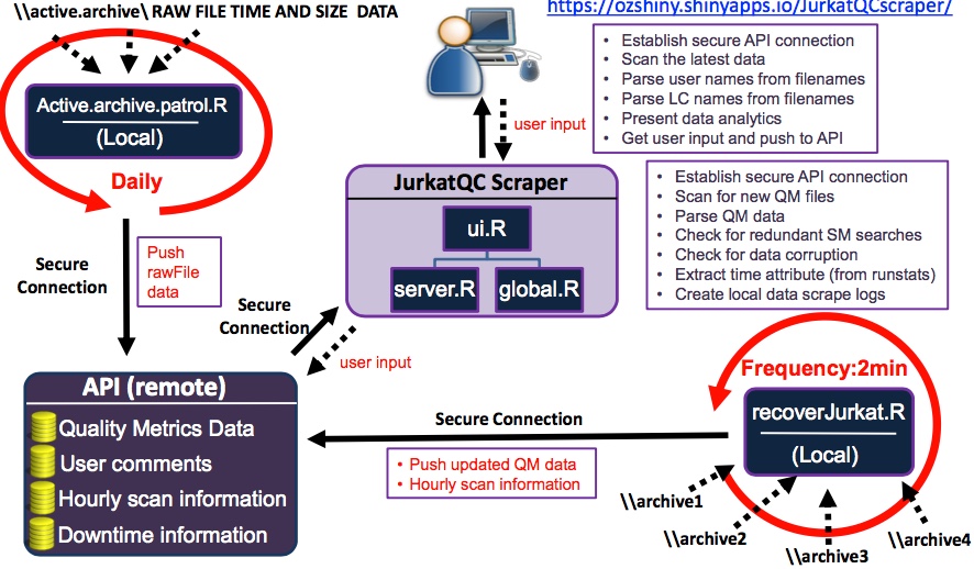
I developed this tool to effectively scrape the quality metrics data generated by multiple instruments in real-time,
streamline data cleaning, feature extraction and harmonization steps. Here is the architecture of the
analytics tool to give you an idea how it works:
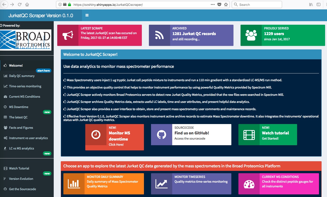
The app welcomes you with some information about the data, a dashboard you can choose amongst many useful
analytics tools that give you real-time information about the streaming data.
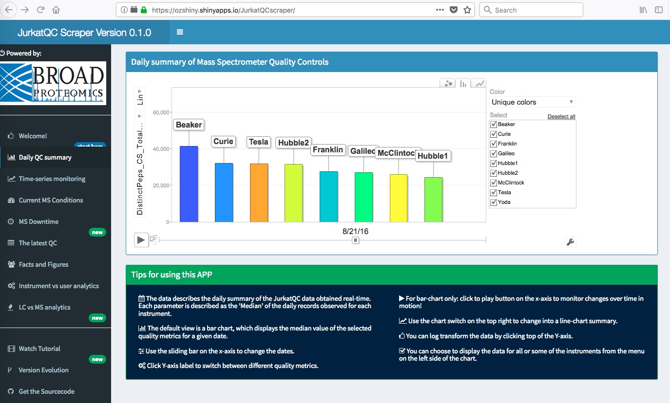
A daily summary of quality metrics I implemented using Google's Gvis package.
This interactive plot is handy when you want to rapidly switch between bar plots and
line plots for a given time-series data:
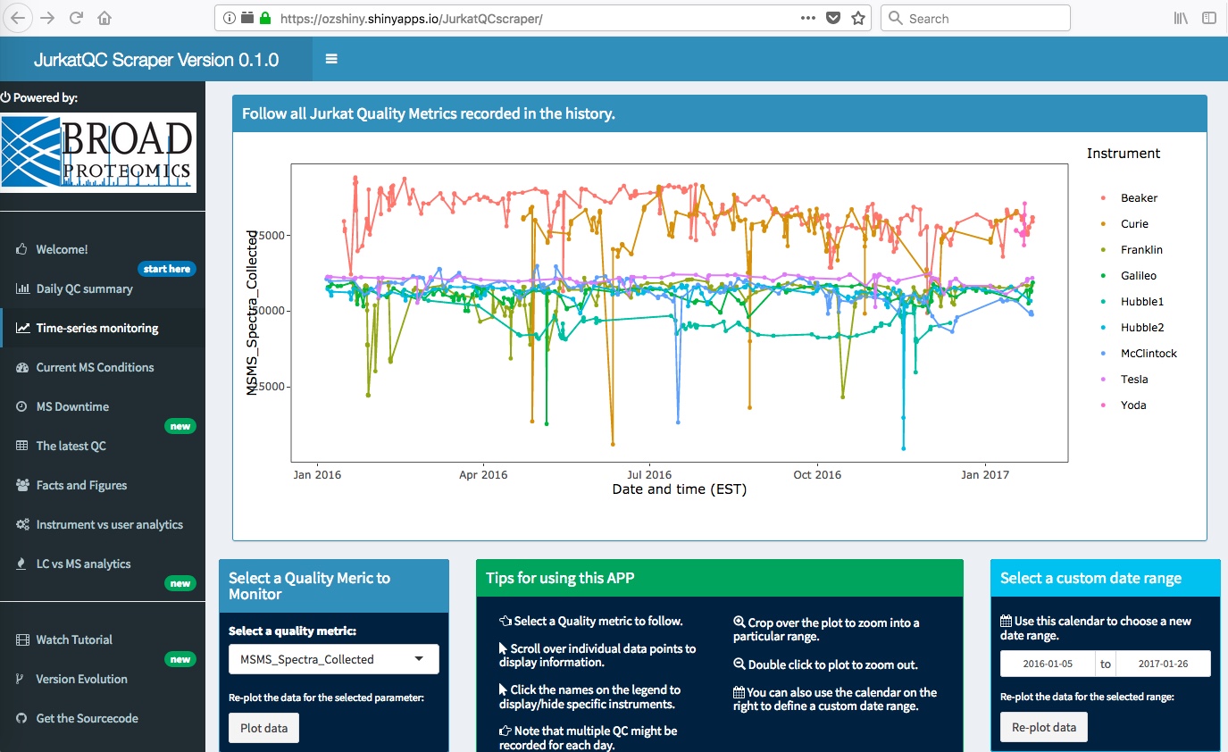
It is often necessary to look into individual points in the longitudinal data and this
plot exactly serves for this purpose. I have implemented in ggplot2, but it nicely coverts into
an interactive graphic thanks to ggplotly extension:
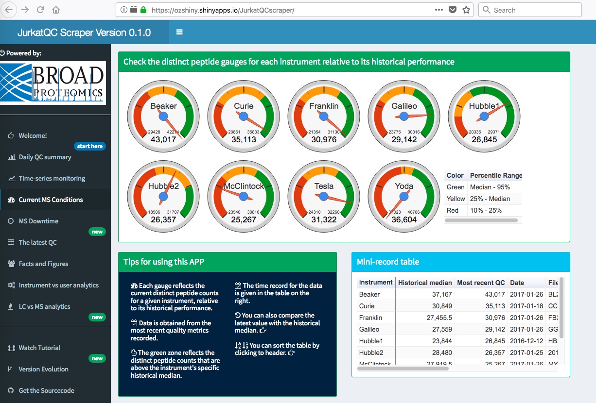
What if you just want to know which is the best performing instrument today?
Alternatively, what if you want to compare the current performance of the instruments relative to
their historical performance? I have implemented these gauges using Google's Gvis package
to provide some insight:
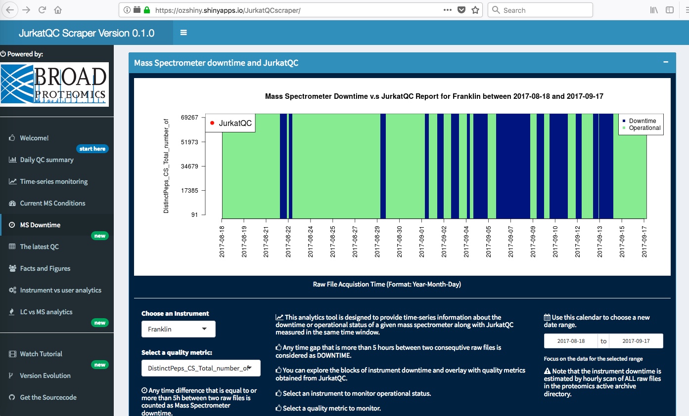
Mass Spectrometers are expensive instruments, they are expensive to obtain,
expensive to run, and expensive to repair. Since it is all about the costs of the operation,
it all comes to getting most data out of them. This implies running them as much as possible,
24 hours a day, 7 days a week. Often this is not the case though. Data acquisition is interrupted
by unexpected events, such as lack of high quality samples or problems in instrument calibration. Here
is a simple tool I implemented to monitor the downtime associated with a given instrument:
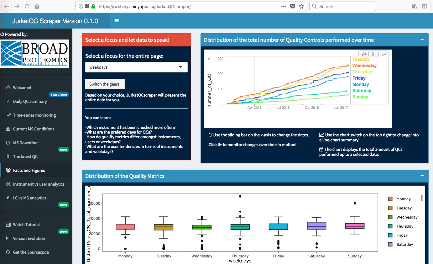
An interesting aspect of quality metrics data is the impact of different days, and users on them.
From operational perpective, this may help to identify systematic performance attributes.
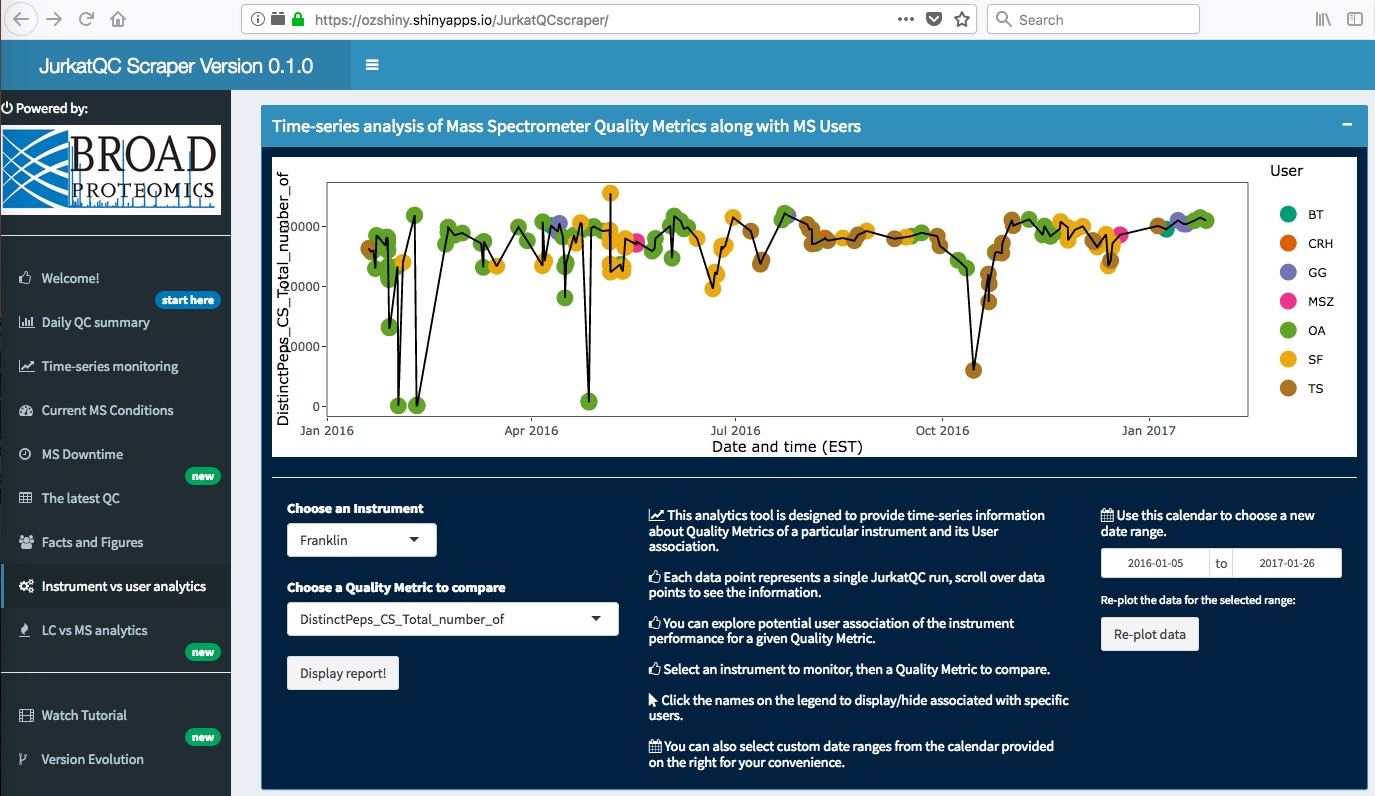
The app also provides an interface to monitor instrument vs user analytics. It is helpful to determine
whether certain performance characteristics are associated with the practice of particular users in various
systems.
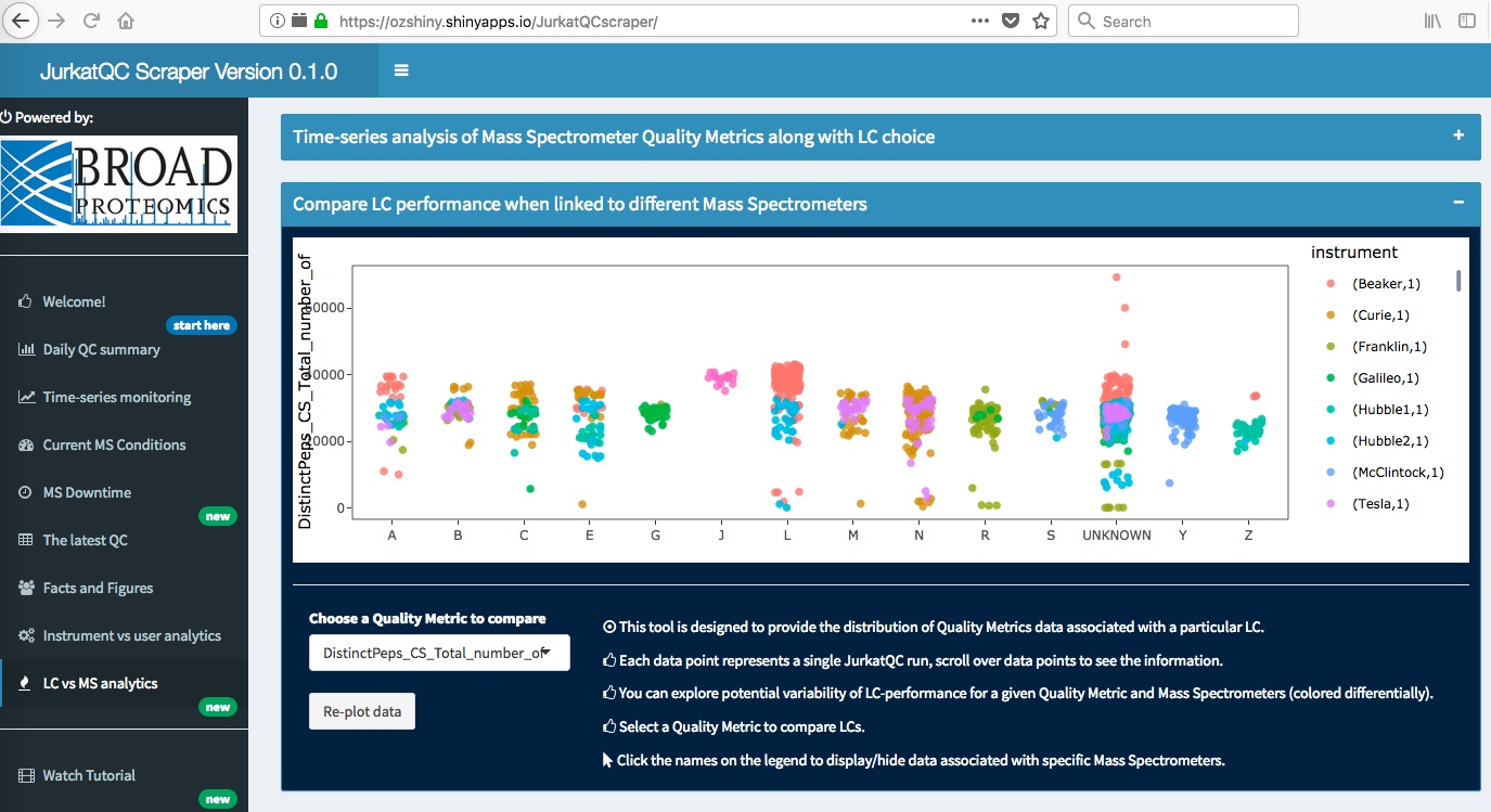
Liquid Chromatography (LC) instruments are coupled to Mass Spectrometers and they have a
profound impact on overall system performance. The app also parses out the LC label from data file names
and associates them with each data point. Hence, it enables powerful analytics to observe the relationship
between individual LCs and Mass Spectrometers.
I hope you enjoyed reading about the features of this app. If you would like to leverage it for your
lab, feel free to fork the sourcecode available in my GitHub repository!